Segmentation is the key to make your data really powerful. Digging into hourly behavioral stats can turn a pile of data into awesome insights. This post demystifies how to use the Google Analytics hourly reports to their maximum potential.
Most often you will analyze and optimize based on data trends. You select a week or month and look at the most important metrics for one segment. And there is nothing wrong with that, it’s actually a good strategy!
However, at certain times you need a more granular report to answer your questions. This is when the hourly reports are immensely valuable.
And that is exactly where I will talk about today!
Table of Contents
- Four Time Settings
- Standard Hourly Reports
- Custom Hourly Reports
- Automate via Google Analytics API
- Group Time Data
- Three Bonus Use Cases
Four Time Settings
Google Analytics allows you to view all report graphs based on days, weeks and months.
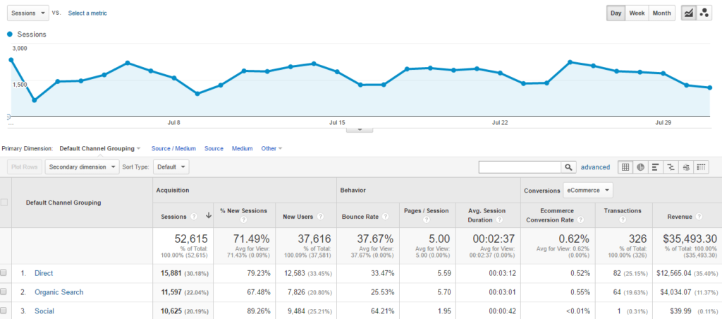
Here is an example report (Acquisition >> All Traffic >> Channels):
 I will show you one more cool thing here.
The Motion Chart (instead of Line Chart graph option) is especially useful if you want to act on (monthly) trends.
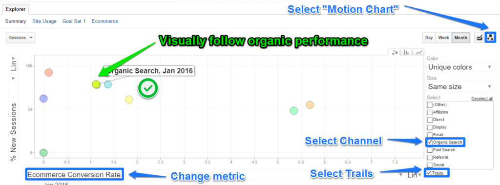
This is a great way to “watch” how your channels are performing and to dig deeper without having to look to static charts.
And perfect to create quick visualizations in Google Analytics.
Once again, don’t try to analyze hourly or daily data with a Motion Chart, but use it for a trend analysis.
In addition there are a few reports you can view on an hourly basis.
For example, the audience overview report:
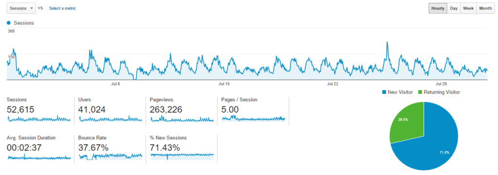 As you can see, this graph is hard to inteprete if you select a full month of data.
Select just one day and your report will look like this:
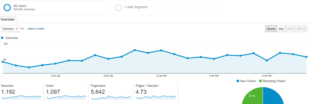 It’s more easy to spot trends here.
However, you want to aggregate data for a longer period of time to derive better insights. I will show you how to do this later in this article.
Please note that the hourly data report is based on the timezone specified in the account view settings.
Standard Hourly Reports
In Google Analytics there are many different standard reports.
Here is a list of reports you can view on an hourly basis or even on a more granular level.
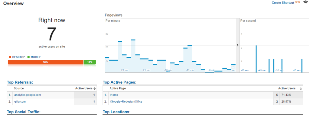
1. Real-Time Reports
Real-time reports are great if you want to perform a quick analysis on a campaign you have just started.
They really come in handy as well when you are debugging your Google Analytics setup.
2. Audience Overview
I already mentioned this report. For a high level overview of a few basic metrics it’s a great report to take a look at:
![Audience Overview expained]() 3. AdWords Hour of Day
3. AdWords Hour of Day
 3. AdWords Hour of Day
The AdWords hourly report is another report worth looking at.
Navigate to: Acquisition >> AdWords >> Hour of Day.
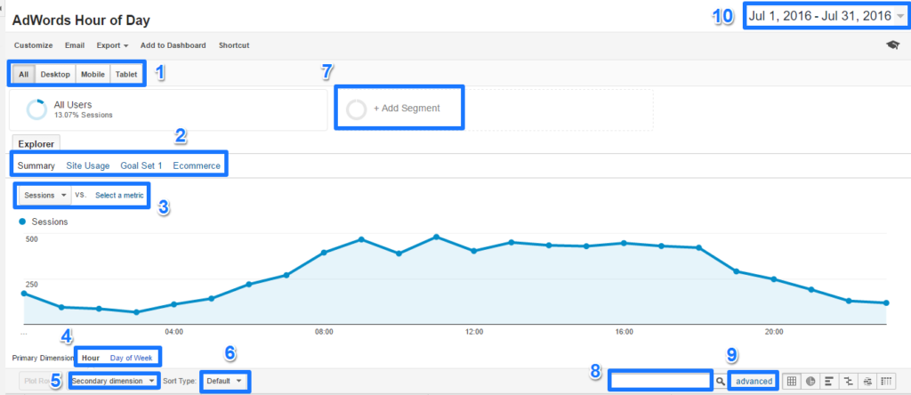
There are many settings that make this report very actionable:
- Review all devices or isolate one device for your analysis.
- High level selection of Acquisition, Behavior or Conversion metrics.
- Select one or two metrics (to compare).
- Toggle between Hourly and Day of Week reports.
- Use the secondary dimension option to further segment your data.
- Apply (special) sorting whenever needed.
- Apply one or more default or custom segments.
- Focus on data points by using table filters.
- Add advanced filters whenever desired.
- Select time period for aggregating hourly session (or other metric) data.
Such a simple report at the first glance, but a lot of hidden, powerful capabilities.
And this is just the start. We are still in Google Analytics. Later in this article I will share a bit more on how to extract this data from Google Analytics.
4. Behavior Overview
You can also view your behavioral metrics on an hourly basis:
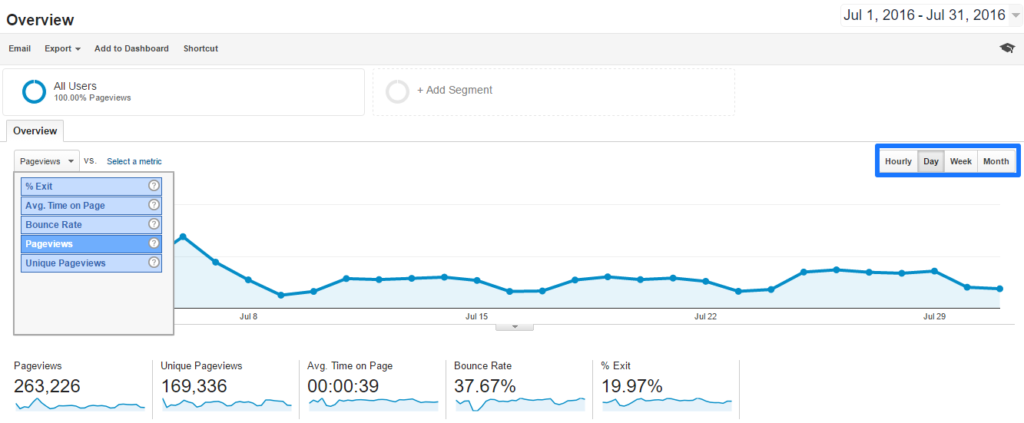 This can be useful to analyze if people behave differently on certain times of the day:
- Do my website visitors see more pages before or after the afternoon?
- How many pages do they see on average between 2 and 6pm?
- Is my bounce rate higher in the morning than evening?
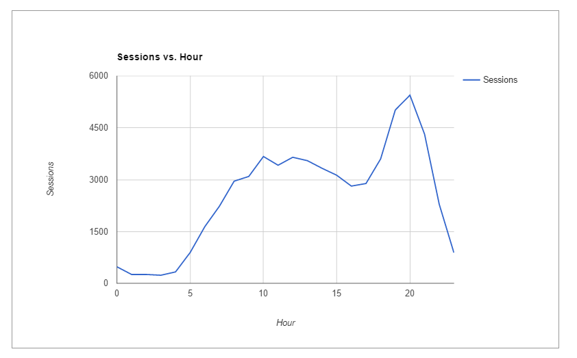
There are a lot of questions you can answer while analyzing this data. I like to aggregate the data into time periods (e.g. 12pm – 6pm). This give more actionable information than if you just look at one hour time stamps.
5. Goals Overview
The last report I like to share is the goals overview report (similar to Audience and Behavior overview):
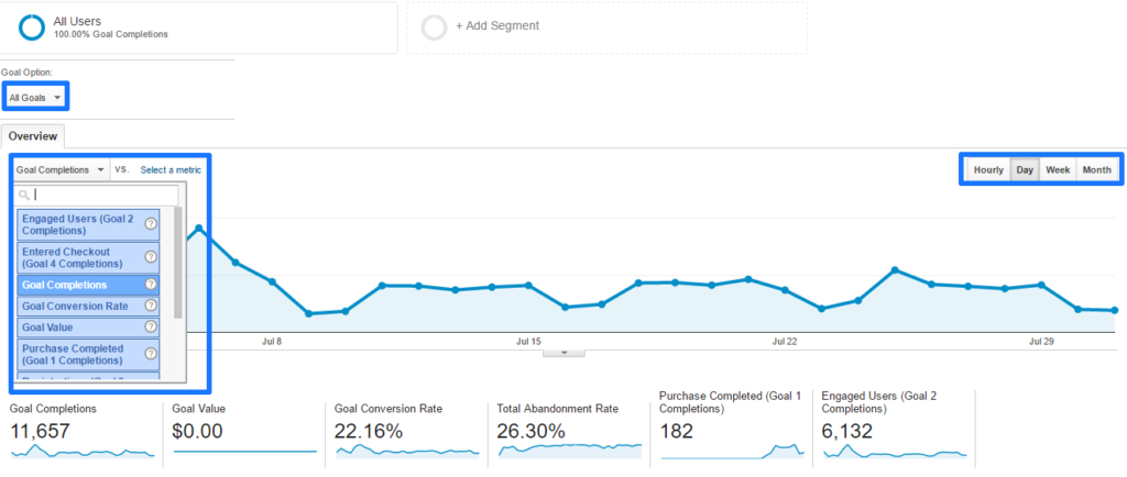 This report helps you to answer similar questions for goal metrics.
One other thing to note here is that you can review your goal metrics for one goal or all goals.
This can make a huge difference especially if you analyze the goal conversion rate.
6. Using a Secondary Dimension for Time
Secondary dimensions are very powerful. They help you to place your data in context and they can be used to drilldown on the hourly dimension.
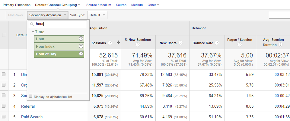 You have three options here:
- Hour: value between 00 and 23.
- Hour Index: index to hour of day.
- Hour of Day: date and hour.
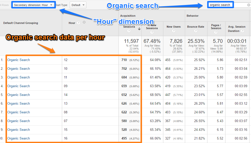
For example, filter on organic search with the “hour” dimension:
The next thing I could do is directly export it to Excel (XLSX format):
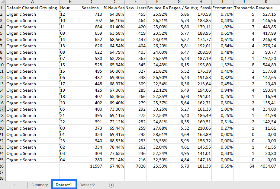 This is not an ideal format because of how Excel interprets the “hour” dimension.
I prefer manual exports when I use the data just occasionally. However, automation is something to think about if you need the data on a regular basis.
Make sure not to automate useless data. This is something I see happening too often.
Learn more about how to export and email reports in Google Analytics.
Hourly reports can be very useful. Always come up with a question that you need to answer first before wandering around in Google Analytics.
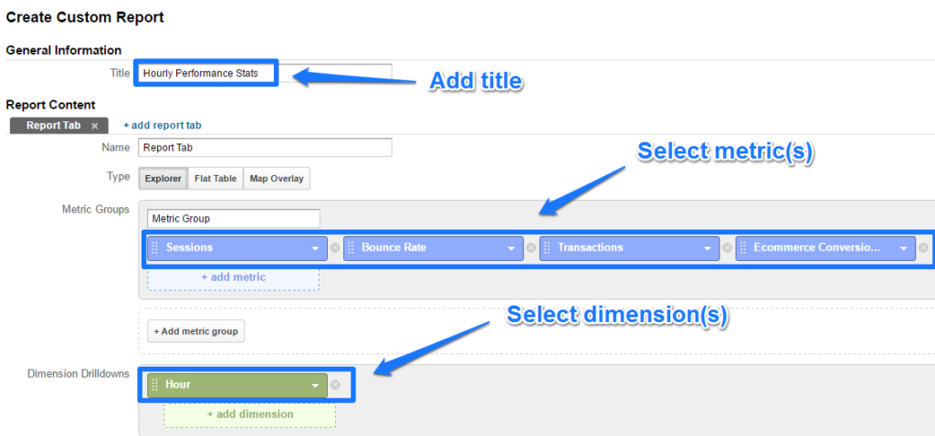
Create a Custom Hourly Report
One of my favourite features in Google Analytics are custom reports.
Every business is different and has different data needs. That makes these custom reports so powerful.
There are three ways to create your next custom report:
- Get inspired by the free Google Analytics solution gallery.
- Edit a current standard report.
- Create a custom report from scratch.
Option 1 and 2 are really great especially if you are starting out and want to learn more about the structure of custom reports.
I don’t use option 1 very often, but editing a standard report can be a huge timesaver!
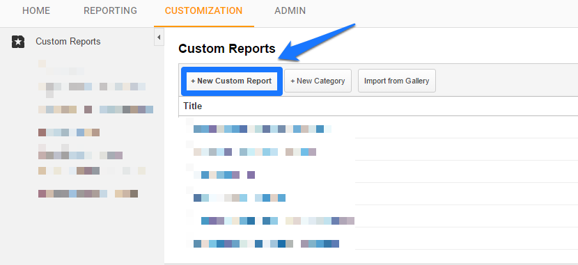
In this case I will go for option 3: create a custom report for scratch.
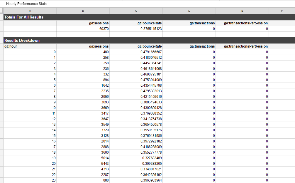
Step 1: click “new custom report” in Customizations tab.
 Step 2: build you report structure with metrics and dimensions (at a minimum).
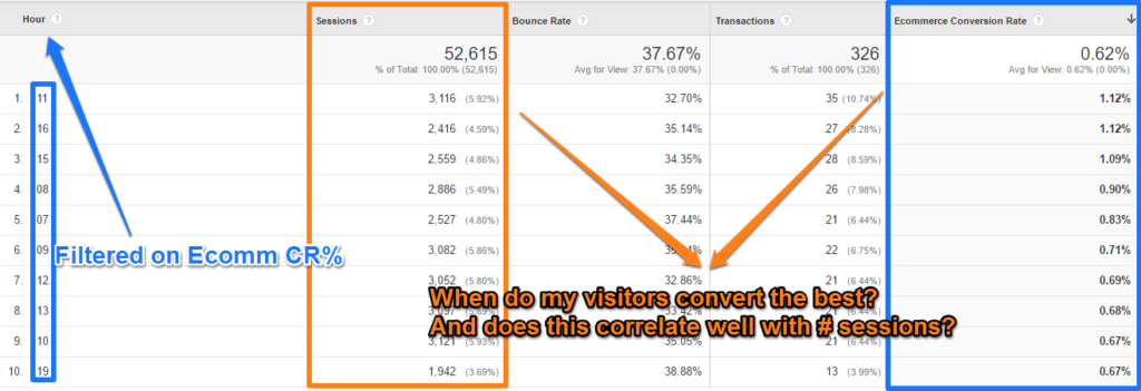
 Step 3: inteprete the numbers in your just created report.
 You are only limited by your own creativity! :-)
Once again, make sure to formulate a business question first before you get too excited about all those report settings!
Automate via Google Analytics API
Automation can be a great help if used wisely.
You can automate your reporting, event tracking, follow-up email campaigns and many more things.
However, you won’t win the battle if you automate just for the sake of automation. This is where many people screw up!
But I assume you are a smart person and you know exactly what you are doing, right?
I have just showed you a custom report. but what if you would like to automate this report for the last 90 days with rolling dates.
Here we go:
Step 1: get the Google Analytics Chrome sheets add-on.
Step 2: launch the add-on.
Step 3: create new report via add-on.
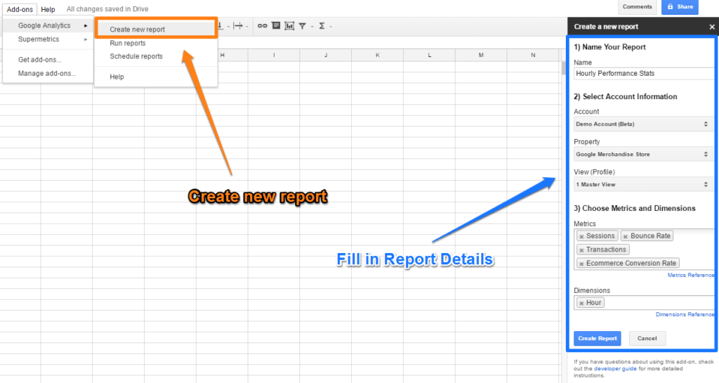
Step 4: apply last modifications to report settings.
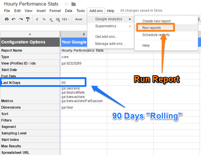
Step 5: admire the results. :-)
 You will see zero’s for the ecommerce stats. This is because I have insufficient access rights to the Google Analytics demo account (I have used in this example) to automate this process. So I had to switch to another view ID.
Step 6: use your visualizations skills.
 You could automate the whole process by using simple triggers.
Navigate to: Add-ons >> Google Analytics >> Schedule reports.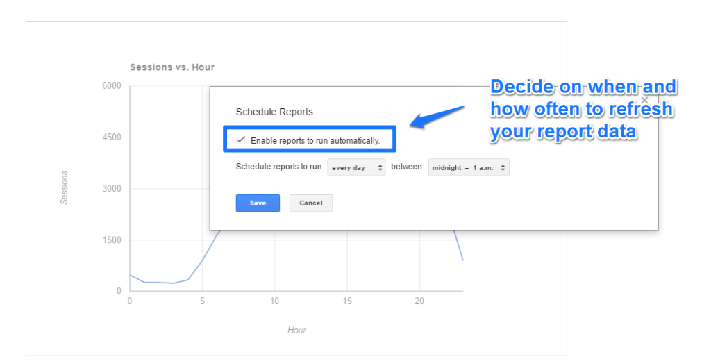 The more experienced you are the quicker you can make this to work. I can finish this “exercise” in less than 5 minutes. Of course, more complex reports take much more time.
So you always have to balance out the time you need to spend to set up the automation compared to what you will eventually gain!
For your records, here are the hour API dimension names:
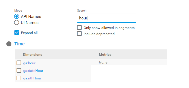 Review a complete overview of all dimensions and metrics that are available here.
Group Time Data
You could use different Excel functions to group your hourly dates into segments.
Here is an example:
- Midnight – 6 am (early morning)
- 6 am – 12 pm (morning)
- 12 pm – 6 pm (afternoon)
- 6 pm – Midnight (evening)
This might make it more easy for you to analyze your data and draw relevant conclusions.
Read this article to learn more about grouping times in Excel.
Three Bonus Use Cases
There are tons of ways to make these hourly reports useful. Let’s take a look at three smart ways to make this data actionable.
1. Online Chat Peak Hours
With the exception of campaigns, the variances on peak traffic will be within a certain margin.
Let’s assume you are selling online courses via your website. One of the highest conversion channels related to online chat.
What if you would know the peak times on your website and when most people hit the “chat” button?

Setting up event tracking on your online chat button combined with sessions per hour will give you all you need to be better prepared.
Get extra resources on the busy times and minimize your resources when you can!
2. AdWords Spend Optimization
What are the best converting hours? When are your competitors visible in AdWords? When is a prior click to conversion the most valuable?
Not all companies have unlimited budgets in AdWords.
This is when you want to know which hours and days of the week are the best to show up.
Here is a a quick read that helps you out on getting the data in Excel.
![Hourly AdWords data]() 3. Mini Shop Optimization
3. Mini Shop Optimization
 3. Mini Shop Optimization
Imagine that you run a huge ecommerce site like Amazon.com.
Amazon runs many different “mini shops” within their ecommerce site:
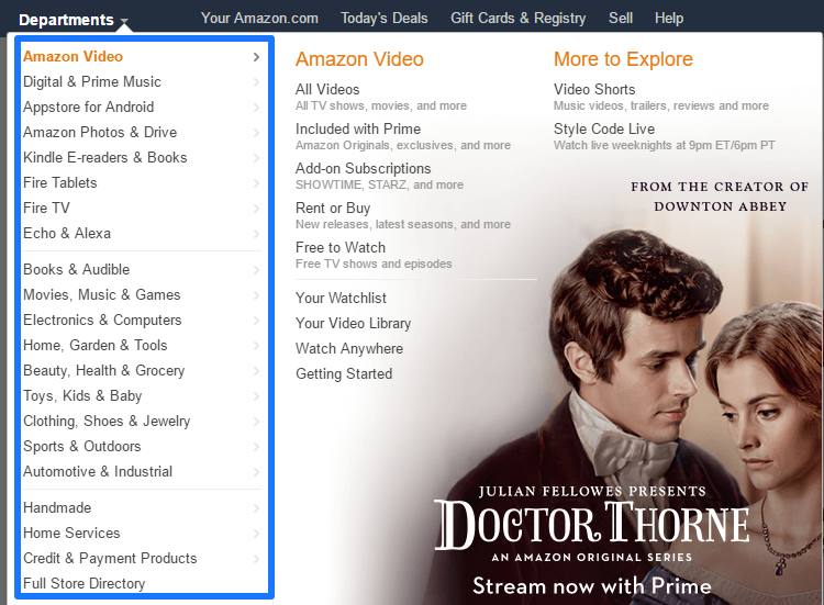 I am sure Amazon exactly knows:
- Cross-shop viewing behavior; do people view many different products from different categories within a session?
- Cross-shop buying behavior: do people tend to buy more products from one category or is it all scattered through different ones?
- Do some categories perform better on certain times of the day?
- Does it make sense for them to focus their “mini shop” efforts on particular times of the day?
In many cases you want to understand visitor and buying behavior on a deeper level. Hourly reports can demystify tons of useful data.
This is it from my side.
By now you have learned a lot about how to use the hourly reports. Make sure to apply this information to your business situation.
These hourly reports should not get your main focus, but can be very useful. Focus on trends and don’t forget the granular details that are hidden in these powerful reports.
Note: don’t use these reports if your hourly traffic and conversions numbers are very low. You won’t be able to draw any reliable conclusions then!
Did I miss something? And what is your most important takeaway?
One last thing... Make sure to get my extensive checklist for your Google Analytics setup. It contains 50+ crucial things to take into account when setting up Google Analytics.Download My Google Analytics Setup Cheat Sheet
The post The Complete Guide to Hourly Reports in Google Analytics appeared first on Online Metrics.