Google Data Studio is a great new tool in the arsenal of Google. I have learned a lot in the last few months and I am happy to reveal dozens of tips on how to work the most effective.
For some people and in some circumstances you still want to build your dashboards in Excel or Google Sheets. At the end it might give some more flexibility.
However, the downside is that not every marketer or analyst has the skills required to build those complex formulas and visualizations in Google Sheets.
Image may be NSFW.
Clik here to view.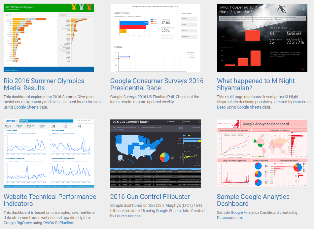
This is where the true power of Google Data Studio steps in. It let’s you create, visualize and share your reports and dashboards in a much easier way.
In this post I am going to share my best tips in working with Google Data Studio and how to get the most out of it.
How to Use Google Data Studio
Image may be NSFW.
Clik here to view.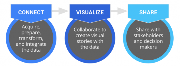
Step 1: Connect to your data sources.
Data Studio allows you to connect to a growing number of data sources.
At the time of writing there are 12 data connectors available:
Image may be NSFW.
Clik here to view.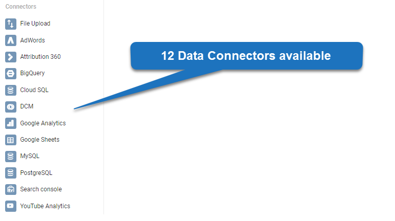 In addition to only linking to your Google Analytics account, there are many other ways to leverage the real power of Google Data Studio.
Make sure to properly set up calculated fields (if needed), use suitable formatting and clean up your data before proceeding to the next step.
Step 2: Visualize your data.
Now it’s time to fill your canvas with beautiful charts that convey the story you want to share with your audience.
It’s even possible to collaborate together on a project! Many of you will already be familiar with this option in Google Docs or Google Sheets.
Image may be NSFW.
Clik here to view.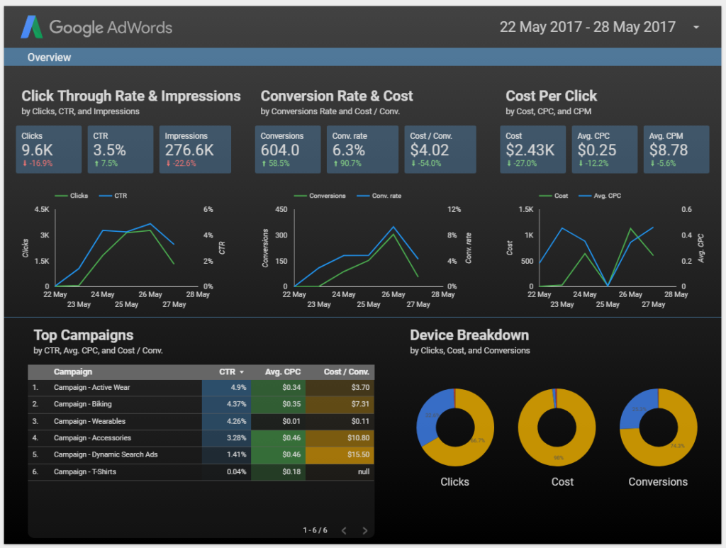
Step 3: Share your project.
The last step is to share your beautiful charts and visualizations with your colleagues or clients.
Make sure to think about with whom to share and on which access level.
Image may be NSFW.
Clik here to view.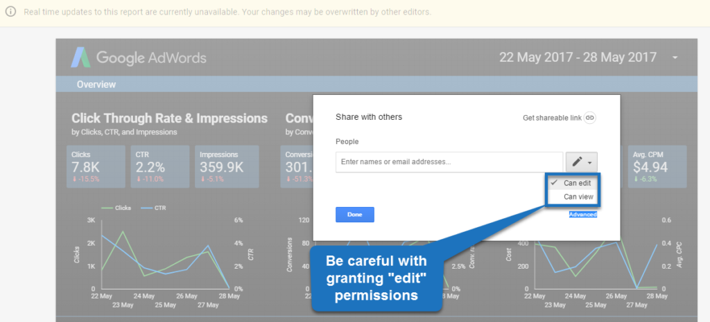
In 2016 this new product was introduced with limited features. But now most of you are able to create an unlimited number of reports for free. This is extremely powerful for agencies who are working for multiple clients or if you have extensive in-house reporting needs.
Did you know that a ton of new features and enhancements are added all the time? You might want to keep track of the release notes of Google Data Studio.
Ok, let’s dive into the tips so that you can get the most out of Google Data Studio.
Tip 1: Define the Requirements
A downside of Data Studio is that it is so much fun to work with. :-)
It means you start buiding, experimenting, changing… and then you think, what does my audience actually want to see and accomplish?
Make sure to ask the right questions before you dive into Google Data Studio to stay away from getting overwhelmed by all that is possible.
Sit down or at least interview your stakeholders first, before you start creating any fancy visualizations.
I know you are smart enough to come up with some great ideas, but make sure to let your audience provide their valuable input as well.
If you do so, you will get the project done much more quickly and end up with a report that produces the actionable insights your audience is craving for.
Tip 2: Watch Data Studio Tutorials
Every solid tool will provide you with some decent tutorials to get started.
The same is true for Data Studio.
Image may be NSFW.
Clik here to view.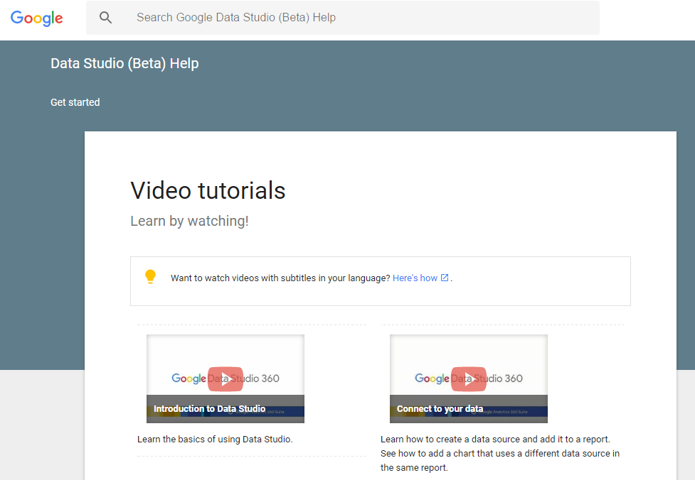
On this page you can learn a lot about important features of this product. It takes just a few hours to get up-to-speed with the basics.
Further, make sure to check out Measureschool’s video on “How to build a Dashboard with GDS”:
Tip 3: Explore the Template Gallery
The Google Data Studio template gallery is another great place to visit if you want to see and find out how great dashboards are built.
There is no better way to conquer a new tool than by looking at examples, listening to tutorials and practicing! Yes, it’s the great combo that does wonders.
Tip 4: Duplicate Your Page
In Data Studio there are two easy ways to add multiples pages to your report or dashboard:
- Add a new page
- Duplicate your page
For the sake of this tutorial I have set up a very simple report based on the data of Google Merchandise Store.
Image may be NSFW.
Clik here to view.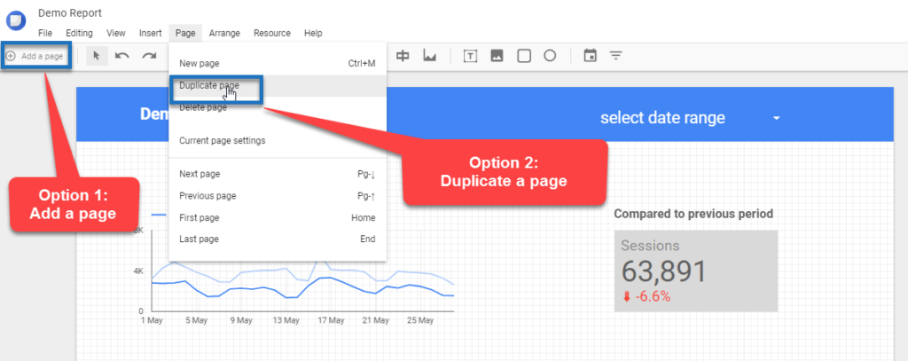
Here is what happens:
Option 1: Add a page.
Image may be NSFW.
Clik here to view.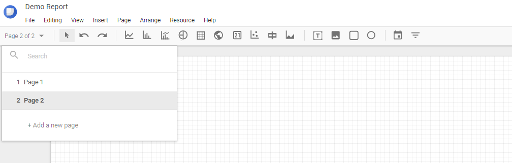
Your second page is empty and you have to start from scratch again. This includes designing a header and footer for your page.
Tip: you can overcome this by using the make-report level feature. Will explain more about this feature later in this post.
Sometimes this can be your preferred option, but at times you might want to re-use multiple objects.
Option 2: duplicate a page.
Image may be NSFW.
Clik here to view.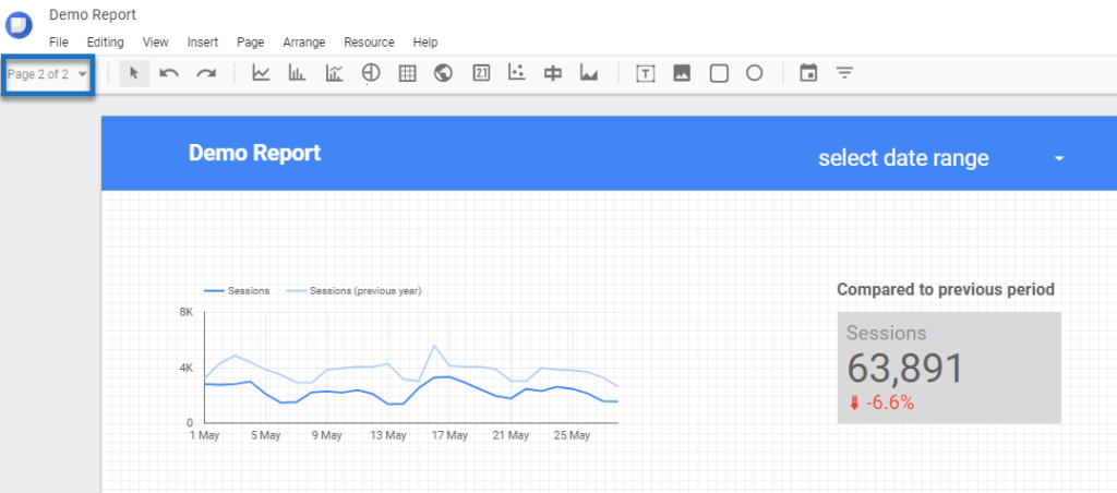 As you can see, the header including charts and other visualizations are copied into the second page of your report.
You can keep all the items that you need and get rid of the rest. This is very handy when building out complex, multi-page dashboards with a similar look and feel.
Tip 5: Name Your Pages
On default, your page get’s the name page 1, page 2 or copy of page 1 etc.
Since you have the option to rename your pages, I definitely recommend to do so. It’s an extra indication of what’s actually on a particular page of your report or dashboard.
Here is a quick example:
Image may be NSFW.
Clik here to view.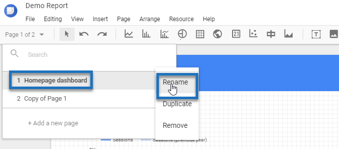
and in “view” mode it looks like this:
Image may be NSFW.
Clik here to view.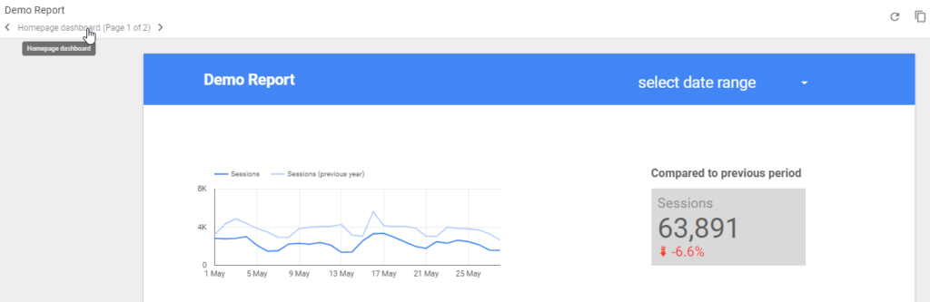
Tip 6: Add Filter Controls
Another great, must-use feature in Google Data Studio is the filter control.
It is shown in the top right corner of your canvas:
Image may be NSFW.
Clik here to view.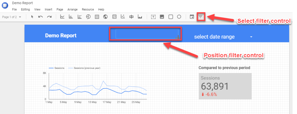
You can choose:
- Which dimension to use in your filter control.
- Which metric to use and whether to show values or not.
- How to sort the filter control.
- All kind of styling options.
Here I have selected the default channel grouping:
Image may be NSFW.
Clik here to view.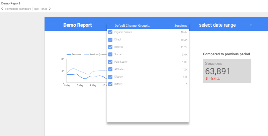
Further settings include:
- Sessions as my metric.
- Sorting by number of sessions.
- Style: expandable and compact numbers.
I recommend to test the different options and see what works for you and your dashboard.
On default the filter control works on all the charts and tables on the page. However, you have the option to limit the scope to one or more objects on the page.
Tip 7: Group Your Objects
There are dozens of reasons why you would want to group multiple objects on a page.
One of them is that you want a filter control to only apply to one or a few charts on your page.
Two ways of accomplishing this.
- Hold you left-mouse button and hover over the objects you want to group.
- Hold the control button and select the objects you want to group.
Then you need to hit control+g to group the objects.
Let’s say you group one chart and the filter control:Image may be NSFW.
Clik here to view.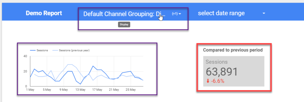 In the example above the purple objects are grouped and the red one is untouched.
You can see the graph displays far less traffic (only Display) compared to the Scorecard.
Then if you decide to ungroup certain objects you simply have to select one of them (that belongs to the same group) and hit control+shift+g. Everything is back to normal then.
You could also use this filter to apply the date range control to a limited number of objects. Or you could use it to simultaneously modify the styling of multiple objects. Grouping is a very useful feature.
Tip 8: Use Object Filters
This option can be very handy if you want to apply a filter to just one of your visualizations.
Step 1: select visualization.
Step 2: go to table properties > data > filter.
Step 3: create the filter that you need and apply it to your visualization.
Image may be NSFW.
Clik here to view.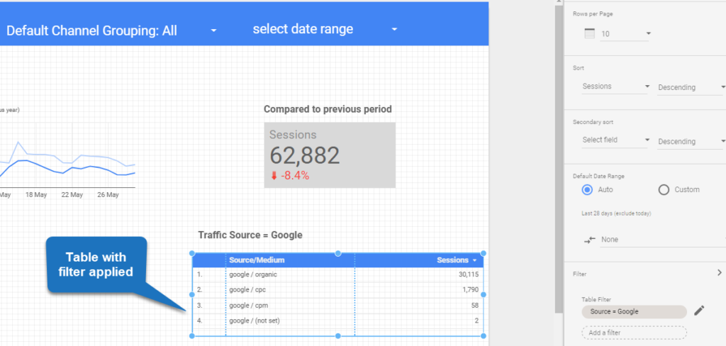
Things to keep in mind:
- The general filter control will override your specific filter.
- You can use the grouping feature to overrule this.
- Specific filters can be re-used on other visualizations.
- You can review all filters under Resource > Manage filters.
Image may be NSFW.
Clik here to view.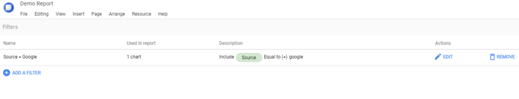 As you can see you can also create a filter here and apply it to your visualizations later.
This is the same as in Google Analytics where you can create a repository of filters in the admin account section.
Tip 9: Copy Your Visualizations
You can save a lot of time by simply copying your visualizations.
This is very handy If you want to apply a common style on multiple objects.
It’s very simple:
- Select the object that you want to copy.
- Hit control+c.
- Hit control+v.
- Change the visualization type and other settings if needed.
I have found this one to be a huge timesaver.
Tip 10: Add Segments
Just three months ago Google released the new option to apply segments to your visualizations.
You can use all system and custom segments that you have created in Google Analytics.
Image may be NSFW.
Clik here to view.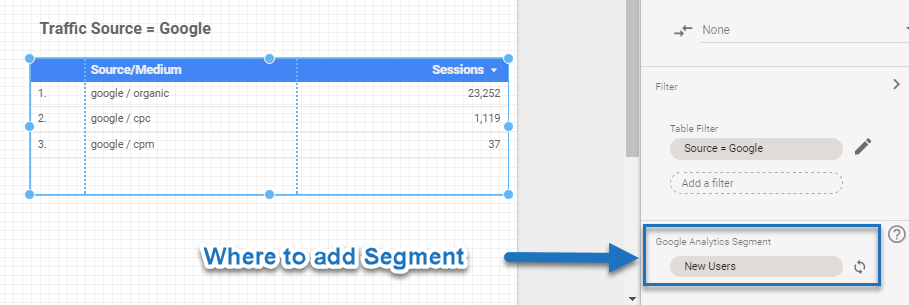
A few things to note:
- You can apply a segment to one or more visualizations.
- You can manage segments via Resource > Manage Segments.
- Turn segment synchronization with Google Analytics off and on (default = on).
Read this beginners article on Google Analytics segments if you are not familiar with this feature yet.
Please note that in Google Analytics and Google Data Studio sampling could impact your data if you apply segments. Read this article to learn more about data sampling.
Tip 11: Learn Shortcuts
As with many tools online, it can be very helpful to memorize the most important shortcuts.
Here is a list of 10 shortscuts that are very useful to know:
- Copy: Ctrl+C.
- Paste: Ctrl+V.
- Undo: Ctrl+Z.
- Redo: Ctrl+Y.
- Select All: Ctrl+A.
- Select None: Ctrl+Shift+A.
- Group: Ctrl+G.
- Ungroup: Ctrl+Shift+G.
- Refresh Data: Ctrl+Shift+E.
- Home: First page.
Tip 12: Make Use of Back and Forward Arrow
You can use four menu functions to realign objects.
Image may be NSFW.
Clik here to view.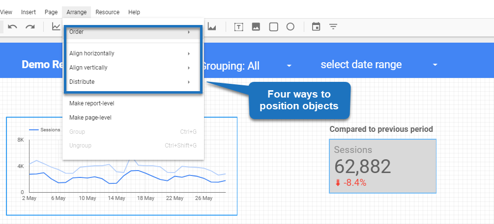 This works pretty well, but sometimes you want to move one of your objects one or two spots to the right or left.
I have found the keyboard arrows (left and right) very effective in this case. It’s much more easy than using your computer mouse.
Tip 13: Change to Report-Level
By default, every component you place on a report is a page-level object. It only appears on the original page on which you place it.
However, sometimes you want your filter control to appear on every page of your report. You can acoomplish this by making it a report-level object.
Image may be NSFW.
Clik here to view.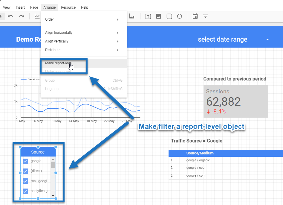
To do this:
- Edit the report.
- Select the filter control (or other component).
- Select the Arrange > Make report-level menu.
Your filter control will now appear in the same location on every page of your report.
The same as that you make an object report-level you can later undo this and turn it back into a page-level object.
Tip 14: Use Different Colors
Color styles help guide the eyes.
Don’t overdo it! But using just one color in your entire dashboard or report might not be your best option.
Here are some general guidelines of what I have found to be effective:
- Use two to six colors max.
- Use colors to clearly show what are the most important visualizations on a page.
- Use colors that match your brand.
I recommend to check out this article to learn more about how to effectively use colors in your report.
Tip 15: Use a Diversity of Charts
You don’t have to use all charts that are available, but make sure to not just use one!
Image may be NSFW.
Clik here to view.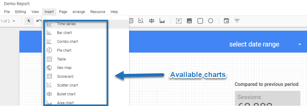
Chart diversity is one way to enhance the effectivity of your dashboard.
Quick tip: you can easily change the chart type after you have build one visualization.
Image may be NSFW.
Clik here to view.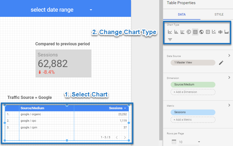
Tip 16: Use Header and Footer
One smart way of filling up your header and footer is by adding report-level objects.
These could include:
- Filter controls.
- Logo.
- Other relevant information for your audience.
Image may be NSFW.
Clik here to view.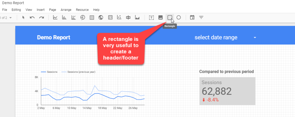
Tip 17: Preselect Date Range
Most of the time you want to include a date range selector in your report.
In “edit mode” you have the option to preselect the date range for your audience.
Image may be NSFW.
Clik here to view.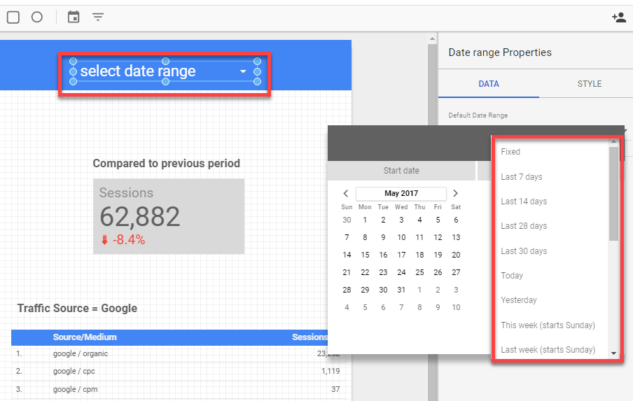
Here is my rule of thumb:
- Always select rolling dates unless you want to show your report data with a fixed timeframe.
- Select “Last week” if your audience always accesses your dashboard at the beginning of a new week.
- Select “Last month” if your audience always accesses your dashboard at the beginning of a new month.
- Use a different preset if your audience has other, specific needs.
Tip 18: Change Field Names of Data Sources
You should have a careful look at field names as they are re-used in many objects that you create.
Here is an example (in view mode):
Image may be NSFW.
Clik here to view.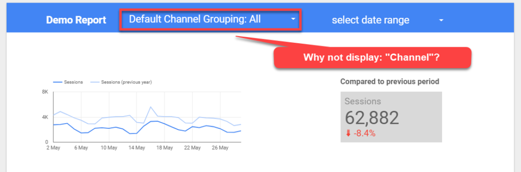 Step 1: go to edit mode.
Step 2: go to “manage added data sources”.
Image may be NSFW.
Clik here to view.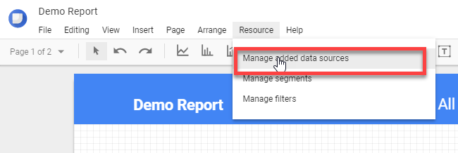
Step 3: click on “edit”.
Step 4: use the search box to filter on dimension.
Image may be NSFW.
Clik here to view.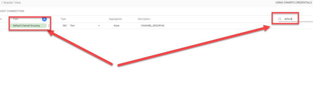
Step 5: change the field name into “Channel”.
Image may be NSFW.
Clik here to view.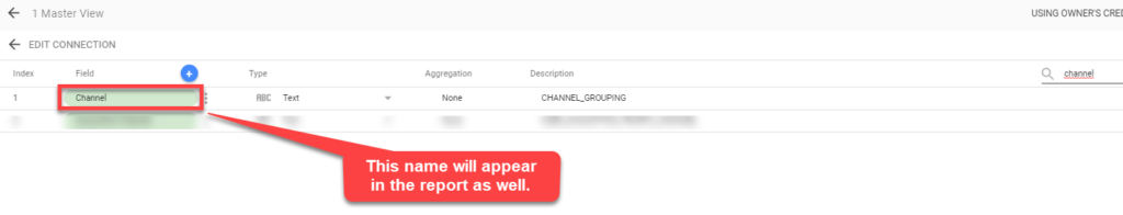 And now go back to view mode.
Image may be NSFW.
Clik here to view.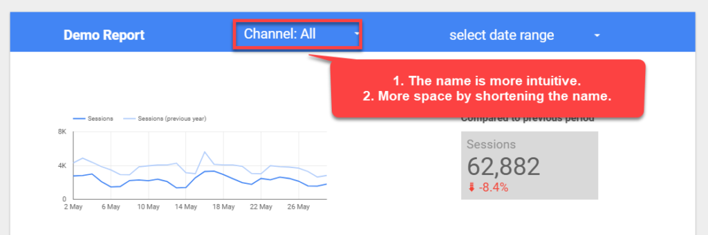 Another useful way to leverage this is by modifying the goal names in Google Analytics. They take up a lot of space on default so you might want to do that as well.
Tip 19: Add Google Analytics Tracking Code
Adding a Google Analytics tracking code is a great feature if you want to track the behavior / activity on one or more reports.
It was added in a new, recent release of Data Studio.
Image may be NSFW.
Clik here to view.![]()
You can make this useful in different ways. Two examples:
- You create an individual report and want to track usage. Create a new GA property dedicated to that report.
- You publish a lot of reports and want to track them all in one place. Again, set up a new property and use the GA code across multiple reports.
Tip 20: Use Calculated Fields
If you are on the free Google Analytics account, you can set up five calculated metrics per Google Analytics view.
Calculated fields in Google Data Studio helps you to create a great set of additional metrics which you can use in your newly built reports!
I recommend to watch this video to learn more about this powerful feature:
Tip 21: Create a Template of Your Report
You might have the need to create additional reports that are similar to the original one.
It’s very powerful to create a copy of your report so that you use it as a template.
Image may be NSFW.
Clik here to view.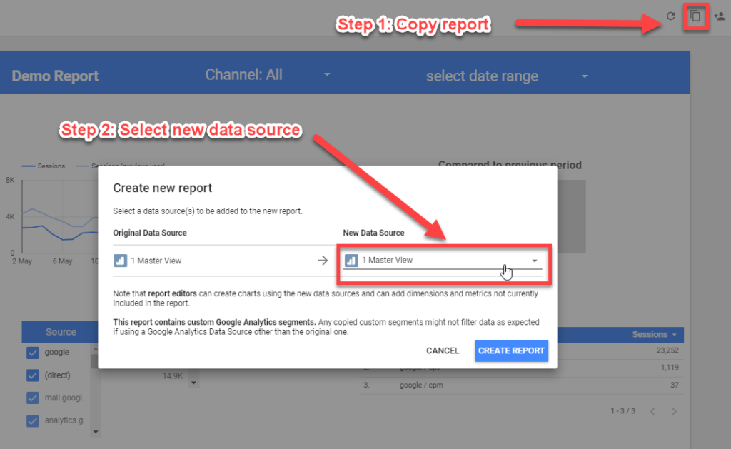
A new report is created after you click “create report”.
Tip 22: Leverage the Power of Google Sheets
Last, but not least, make sure to try out Google Sheets as one of your data connectors.
In my recent post about powerful Google Analytics tools, I explain about Google Sheets add-ons that bring a tremendous value in your reporting efforts. You should check it out to learn more!
The beauty is that you can connect several different data sources to Google Sheets and then connect Google Sheets to Google Data Studio.
I might write an entire post on this so that you can learn how to leverage this in your unique situation.
This is it from my side! Let me know in the comments if you any further tips or questions. It’s an amazing tool and new features will constantly be added!
One last thing... Make sure to get my extensive checklist for your Google Analytics setup. It contains 50+ crucial things to take into account when setting up Google Analytics.Download My Google Analytics Setup Cheat Sheet
The post 22 Tips to Get Up-to-Speed with Google Data Studio appeared first on Online Metrics.